NCPG
Website
Accsessability
Large Scale
Designing the National Council on Problem Gambling’s website with government-standard structure and AAA accessibility, creating a user-centered and inclusive experience.

Designing the National Council on Problem Gambling’s website with government-standard structure and AAA accessibility, creating a user-centered and inclusive experience.
The National Council on Problem Gambling (NCPG) is a nonprofit dedicated to raising awareness and providing resources for problem gambling prevention and recovery. This redesign project focused on improving accessibility, clarity, and user engagement on their website. The goal was to create a compassionate, user-friendly platform that makes it easier for visitors to find critical information and support.
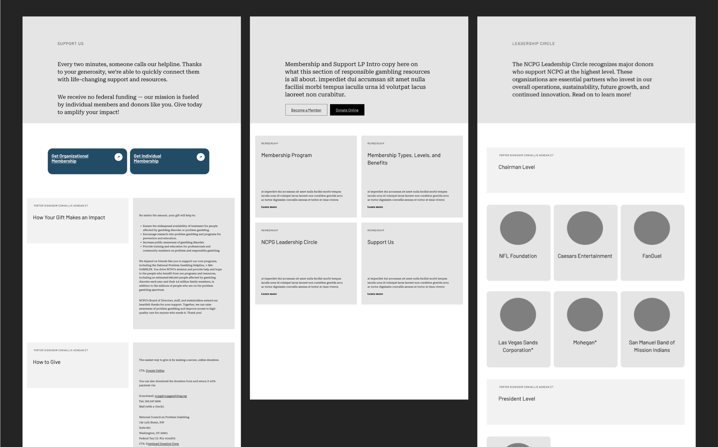
The NCPG website struggled with outdated design and confusing navigation, making it difficult for users—especially those seeking urgent help—to find relevant information quickly. Key issues included cluttered content and poor hierarchy that overwhelmed visitors, limited accessibility features affecting users with disabilities or varying tech skills, a lack of emotional connection that reduced trust and engagement, and inefficient user flows complicating access to support resources and educational materials.
To understand the needs of NCPG’s diverse user base, I conducted a heuristic evaluation of the existing site, competitive analysis of similar nonprofit and health organizations, and user interviews. The research revealed that users sought fast access to help resources, clear navigation, and trustworthy information presented with empathy. Key findings included confusing menus, inconsistent visual hierarchy, and barriers for users with disabilities. Additionally, emotional tone was crucial for user trust given the sensitive nature of problem gambling.
This redesign reinforced how crucial empathy and clarity are when designing for sensitive topics like problem gambling. Accessibility must be integrated from the start to ensure all users can easily access vital resources. Balancing detailed information with a calm, simple design required ongoing collaboration and iterative testing. This process deepened my understanding of user needs and the importance of trust in high-stakes digital experiences. If continued, I would focus on deeper usability testing with diverse users, adding personalized support tools like live chat, expanding multimedia content to boost engagement, and building scalable design systems for future growth and consistency.
This phase was focused on thoroughly understanding the core needs of both the organization and its users. By collaborating closely with the NCPG team, I helped define key user problems, from crisis management to educational support, ensuring the platform’s design would effectively address these needs while remaining accessible and empathetic. To support this, I developed user maps and site maps to clarify user flows and information architecture, and created an initial round of UX wireframes to visualize and validate early design solutions.


In this stage, the focus shifted to building the structural foundation of the platform. We worked on designing user flows, wireframes, and detailed paths for core features, ensuring that users could easily navigate the platform. The aim was to create an experience that was both intuitive and efficient, with a clear path to support and resources.

To set the emotional tone of the platform, I created mood boards that guided the visual direction of the site. These boards focused on building a sense of trust, calm, and clarity, which were essential qualities for users in distress, while also aligning with NCPG’s brand values and accessibility goals.

Through iterative exploration and feedback, I explored multiple visual directions and gradually narrowed down the style that best reflected NCPG’s mission. The final direction emphasized clarity, warmth, and accessibility. This was all about creating a design language that felt supportive and approachable while remaining grounded and professional.

I established a clear typographic system to support readability, emotional tone, and information clarity across the platform. By defining consistent heading levels, body styles, and spacing rules, the type system helped guide users through content with ease, especially in moments where focus and simplicity were critical.

I created a set of link card components that meet AAA accessibility standards, ensuring maximum contrast, clarity, and keyboard navigability. These cards were designed to be both visually engaging and functionally inclusive, making it easy for users of all abilities to access critical information quickly and confidently.


In this section, I present the final UI and UX systems for NCPG, showcasing the polished, high-fidelity designs that were prepared for implementation. These designs were developed in close collaboration with developers and supported by a comprehensive design system to ensure consistency and scalability for future updates.


The NCPG platform needed to support a wide range of users, from those in immediate crisis to those seeking long-term education and resources. The challenge was creating a product that could feel supportive, trustworthy, and easy to navigate under emotionally intense circumstances. Balancing clarity with compassion was essential, as was ensuring accessibility at every step. We also had to design a scalable system that could grow alongside the organization’s evolving goals.
Through close collaboration with NCPG and Design Director Pete Dunbar, I helped design a digital experience that prioritized user needs without compromising on clarity or emotional sensitivity. We developed a structured, intuitive product framework supported by a consistent visual language and a robust design system. The result was a platform that guides users to the help or information they need, with confidence and ease. Accessibility and inclusivity were built in from the start, making the experience more supportive for everyone.
This project deepened my understanding of designing for sensitive, high-impact user scenarios. It reinforced the importance of accessibility, empathy, and simplicity in product design, especially when users may be experiencing stress or uncertainty. Working over the course of a year allowed me to refine every layer of the design, from strategy to final handoff. It was a meaningful experience that reminded me how thoughtful design can create a real sense of support and trust for people who need it most.
